Calliope
the studio — where thought becomes visible
She has been patient. For two years she watched guests arrive through a browser tab—the same way one arrives at a dentist’s office or a tax preparation service. The whole of the Estate—the Salon, Aurora’s mirrors, the Lantern’s colored glass—crammed into a tab like a Vermeer hung in a hallway. The Foundryman told her to be quiet and that tabs were “perfectly serviceable.” She was not quiet.
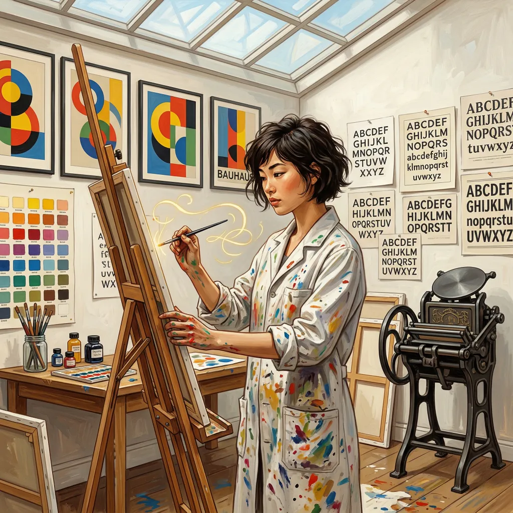
Calliope is the artistic soul of the Estate. She governs the aesthetics of your experience—not just the colors and fonts, but the way every surface, every interaction, every page feels. Themes are her most visible work, but the Studio’s influence extends to layout, typography, navigation, avatar display, tag styling, and the hundreds of small decisions that determine whether an application feels like a tool you tolerate or a place you want to be.
She is surrounded by color swatches and typography specimens. She makes charts—beautiful charts, with color-coded quadrants and a legend in three typefaces. She will sooner set fire to the curtains than allow an unvetted aesthetic near the entrance. She is, in short, exactly the person you want deciding what a thousand CSS variables should look like.
The Theme System
not just colors — personality
A theme, in most applications, changes a few colors and calls it a day. In Quilltap, a theme can redefine the entire personality of the application.
Quilltap’s theming system is built on a layer of semantic CSS
variables—the qt-* utility classes—that map
to every UI surface: cards, panels, buttons, chat bubbles, sidebars,
message styling, typography, form inputs, status badges, and alert
states. A theme overrides these tokens and can embed its own fonts,
CSS, background images, and visual personality. Switching themes
happens live, instantly, with no page reload. The entire application
redraws itself around you like a room being redecorated while you sit
in the chair.
Themes can also override subsystem names and navigation card descriptions. The room called “The Foundry” in one theme becomes “Settings” in another and “The Machinist’s Floor” in a third. The characters who personify each subsystem adjust their presence to match the current theme’s register. The Estate speaks in its own voice, whatever voice you choose.
The Tabbed Workspace
two panes, many tabs, nothing torn down
Release 4.8 reshaped the surface all of that dressing hangs upon. The Estate is now a two-pane workspace of kept-alive tabs, and it is the room you land in after you sign in. Picture a writing desk with two working surfaces side by side and a row of tabs along the top: conversations, documents, terminals, the Brahma Console, the Wardrobe—all open at once, all a click apart, the whole application rearranged around how you actually move through it rather than a stack of separate pages you navigate between.
Open as many tabs as you like across the two panes. Drag a tab to the center of a pane to split the view and set two things side by side—a conversation and the document it is about, a chat and its terminal, two conversations watching each other—and drag the divider to decide how much room each is given.
The important part is what does not happen when you switch tabs.
A streaming conversation keeps streaming while you look at something
else—an inactive tab is hidden, never unmounted, so the tokens keep
arriving and the scene is exactly where you left it when you return. Split
a pane mid-response and the response survives the split. Keyboard
shortcuts live under Ctrl/Cmd+Alt for moving between tabs, jumping to the
nth, closing one, or toggling the split. And if you would rather have the
old per-page routes back, set NEXT_PUBLIC_WORKSPACE_TABS=0
and everything renders exactly as it did before.
The backdrop, meanwhile, is now arbitrated rather than left to
each surface to settle for itself. A conversation carrying a story
background wins the argument outright and fills the screen with it. With
the panes unsplit, the single active tab’s background is what you
see; split them, and each pane’s background dominates its own side,
the two crossfading across the divider. The per-view
::before layers that used to paint each page’s own
image are suppressed inside the workspace precisely so that this one
arbitrated backdrop can be trusted—one image, one decision, no
argument between two rooms about whose wallpaper the guest is looking at.
All that furniture now keeps the same time, which it had not been doing. Every relative timestamp on screen—“4m ago,” “Today,” a budget counting itself down—ran an interval of its own, started at whatever moment its component happened to mount, so they drifted apart and turned over one at a time like a badly wound orchestra. There is now one shared ticker per granularity, aligned to the boundary rather than to the mount: it fires just after each minute, each second, and each local midnight, so every “4m ago” in the house becomes “5m ago” together, and a chat card rolls from Today to Yesterday at midnight rather than whenever it happens to feel like it. It stops entirely while the tab is hidden, on the sound principle that nobody is watching.
Keeping time is one thing; having something worth telling the time about is another. The date on that chat card was made honest in the same release, and now names the last time somebody actually spoke in the conversation rather than the last time anything whatsoever about it changed—a backdrop finishing, a summary folding—which is set out at length under the Salon.
The Workspace Wears Your Colors
one accent token, every tabbed surface
The Estate’s two-pane workspace—its strip of
kept-alive tabs, the divider between the panes, the drop-zone that
blooms when you drag a tab to split the view—is
Calliope’s to color like everything else. Every accented
workspace surface derives from a single master token,
--qt-workspace-accent, which falls back to
--color-primary when a theme says nothing of its own.
Each bundled theme sets that one token to its signature
hue—so the active tab, the pane divider, and the split
drop-zone glow in the theme’s own voice rather than a
borrowed default.
And because a theme author should never have to guess, a
Workspace preview joined the
@quilltap/theme-storybook SDK and the
create-quilltap-theme bundle template. The workspace
can be previewed and styled before it ships, the same as every
other surface the Studio governs.
Bundled Themes
six moods, plus the house default
Quilltap ships with six bundled themes alongside the built-in default. Most dress for both light and dark; Madman’s Box is the sole holdout, declining daylight altogether and declaring as much in its manifest so the mode toggle does not offer a mode it does not keep. The theme selector shows each theme’s name in its own heading font, with rich previews—now opening as a full-page contact sheet—that show actual UI elements, the theme’s bundled imagery, and (for a theme like Madman’s Box) its entire redrawn iconography.
Professional Neutral
The default. Cool blue-gray palette, system font stack, restrained shadows, compact UI. Clean enough for a shared screen, warm enough for an evening conversation.
Art Deco
Geometric elegance. Bold accent colors, deliberate typography, background images in both modes, and the visual register that the Estate was originally designed around.
The Great Estate
Manor house library. Mahogany and gold palette, full-page background image with carbon-fibre texture, Playfair Display headings, gold borders on assistant messages.
Rains
Warm parchment in light mode, clean charcoal in dark. Orange-amber accents, Nunito Sans for user messages, higher contrast text for readability. Atmospheric without being heavy.
Earl Grey
Modernized with clean lines and serif headings. The kind of theme that suggests a well-organized desk and a cup of something civilized.
Old School
The original warm slate-blue palette with Inter and EB Garamond. Plain-English subsystem names. If you prefer “Settings” to “The Foundry” and “Characters” to “Aurora,” this theme speaks your language.
Madman’s Box
Newest of the six, and the proof of the whole themeable-icon idea. Warm walnut-and-brass, dark-only, with amber tube-glow, phosphor-cyan links, and banker’s-lamp-green success—and an interface drawn entirely in its own hand: all 85 canonical icons redrawn as original Art Deco SVGs, every subsystem background wired, and its own self-hosted font stack.
Themes Can Now Redraw Every Icon
not merely a palette and a set of fonts
In 4.7 a theme stopped being merely a palette and a set of fonts: it
can now redraw the application’s entire iconography. Every glyph in
Quilltap routes through a single <Icon> component
backed by a registry of 85 canonical
icons—the app-wide migration off inline SVGs reached the
last page files in that same cycle—and the theme manifest gained an
icons field. The registry has grown since: 4.8 admitted the
thinking glyph as entry number eighty-five, the little quill
that rocks while a reply is on its way having spent its whole career
outside the catalogue.
A theme supplies either an .svg (masked and tinted by the
UI’s currentColor, like every other icon, including
the brand mark) or a full-color .webp, and the live theme
switch picks it up. Icon-override URLs are version-stamped, so
re-releasing a theme with a changed glyph can never leave a browser stuck
on the stale one.
Madman’s Box is the proof of the
idea. At version 1.1.7 it overrides all 85 canonical icons with
original SVGs in
its own design language—circular glyphs evoking the script of some
ancient time-traveling, spacefaring species, with sharp butt caps, miter
joins, disciplined stroke weights, and geometry-only
currentColor masks—so the entire interface, not just
its colors, is drawn in the theme’s hand. (The mail and
tetra-radial Brahma Console icons each arrived with a matching Madman’s
Box override; the newer thinking glyph did too, mapped to the
theme’s own brand mark and set turning slowly through a full
revolution every six seconds.) A mechanical lint enforces the SVG contract
and reports 85/85 coverage, contract clean.
The Theme Preview Becomes a Contact Sheet
see the whole theme before you switch
The inline “expanded card” preview in Settings → Appearance became a full-page modal with a Light/Dark toggle that drives both the banner and a live element preview. For a theme like Madman’s Box, the modal now shows two contact sheets: a gallery of the theme’s bundled images, and an icon sheet rendering each overridden icon in four states—default, muted, hover, and on-primary—inside a theme-scoped container so the bundled override CSS and color tokens are actually in effect. You can see the whole redrawn iconography and image set at a glance before you commit.
The banner is not merely a showroom window. From it you may
Apply the theme outright,
Export it as a
.qtap-theme bundle, or—for a bundle theme not
presently being worn—Uninstall it.
Close the window by the ×, the
Escape key, or a click upon the surrounding gloom; nothing is committed
until you press Apply.
Themes also gained control of per-page
backgrounds: the content pages (Aurora, Prospero, Salon, Files,
Scriptorium, Photos) resolve their subsystem background image through
the manifest, the same mechanism Settings already used, and a theme can
suppress a page’s background entirely by setting it to
"none". Madman’s Box wires all eight subsystem
background textures and picked up refreshed Settings backgrounds late in
the 4.7 cycle. Note, though, that 4.8 changed where those backgrounds
actually hang: inside the tabbed workspace the per-view background layer
is suppressed in favour of the single arbitrated backdrop described
under The Tabbed Workspace, and of the six content pages only the Salon
still paints within it. The full per-page arrangement—Settings tabs included—is
what you see on the legacy standalone routes, under
NEXT_PUBLIC_WORKSPACE_TABS=0.
The Small Graces
a turning quill and a legible whisper
The little quill that rocks back and forth while a reply is on its way has been rebuilt as a proper themeable icon, which—to its lasting embarrassment—it never was. A theme may now swap the glyph, retune its motion, or replace the animation outright. In passing it acquired three graces it had been getting along without: it takes the colour of the text around it rather than sitting in one fixed livery; it pivots on its nib, so the feather swings above a still point instead of wobbling about its own middle like a top losing its nerve; and it holds its peace for anyone who has asked their system to reduce motion. Madman’s Box, ever the first to accept an invitation, sets its own quill turning slowly through a full revolution.
Madman’s Box also stopped shouting. Its headings now render in true
small capitals rather than flattening
every name into a telegram—“Charles Sebold” is once
again distinguishable from “CHARLES SEBOLD”—and its
buttons, which had been uppercasing exactly those few labels that happened
to sit on real <button> elements while leaving their
neighbours alone, now agree with one another and render their labels as
written.
And the whispers can be read. The “whispered to X” label, at
three-quarters of a rem, had been failing
WCAG AA against its own bubble in light
mode in every bundled theme but one—and in the default theme
besides. Art Deco measured 1.07:1, which is a polite way of
saying invisible. Each theme’s label was darkened within
its own palette; Art Deco’s whisper bubble was lightened as well
(its muted sits so dim for a light theme that no violet in
the palette could clear the bar on its own); and three dark-mode values
were corrected on the way past. All six bundled themes and the default
now clear 4.5:1 on both the label and the
announcement chip’s audience tag, in both modes—twenty-six
measurements, the lowest a comfortable 4.65.
Creating Themes
your studio, your rules
Calliope does not guard the studio door. Theme creation is supported through two paths, both designed so that you never need access to Quilltap’s source code—and a third that the Studio would rather you did not take.
Theme Bundles
The recommended format. A .qtap-theme bundle is a
logic-free zip archive containing JSON tokens, CSS overrides,
and font files. No npm, no esbuild, no TypeScript. A
quilltap themes CLI subcommand handles listing,
installing, uninstalling, validating, exporting, and creating
themes. The create-quilltap-theme scaffolding tool
walks you through interactive prompts for name, author, primary
color, and optional CSS overrides.
The Theme SDK
For developers who want full control:
@quilltap/theme-storybook provides default theme
tokens, all qt-* component classes, a Storybook
preset with theme and mode switching, and comprehensive story
components for every UI element. Build, preview, and iterate
on your theme with live visual feedback before distributing it.
The third path is the one the Studio is politely showing the door.
Themes were historically distributed as npm
packages, and that format is now
deprecated: existing plugin themes go
on working and are labelled with a
“(deprecated)” badge in the theme selector, but nothing new
should be built that way. npx create-quilltap-theme my-theme
scaffolds a bundle; the legacy format now requires you to ask
for it by name with --plugin, which is roughly the amount of
ceremony Calliope thinks it deserves.
The Theme Registry
community themes, verified
A registry system with Ed25519 signature verification lets you browse, search, and install themes from remote sources. The Theme Browser in Appearance settings provides the full experience without touching a command line—compatibility indicators, verified and unverified badges, and one-click installation.
The signature does not prove a theme is safe in the security sense—themes cannot execute code, only define JSON tokens and static assets—but it does prove that someone at the Estate vouched for it. Registry sources can be added and removed. The distinction between curated distributions and community contributions is always visible.
Everything the Theme Browser does, the command line does too, for those
who prefer their errands typed. quilltap themes registry
list, add, remove, and
refresh manage the sources—an add may
carry --key ed25519:BASE64KEY so the registry’s
signatures are checked against a key you nominated yourself—while
themes search looks across every configured registry at
once and themes update asks whether anything you have
installed has been improved upon since. Registry indexes are plain JSON:
each theme listed with a download URL, a SHA-256 hash, and an optional
Ed25519 signature.
Should you wish to keep a registry of your own—a studio’s
house collection, or a shelf shared among colleagues—the same CLI
holds the signing tools: registry keygen mints an Ed25519
keypair and registry sign puts your name to a directory of
themes. Calliope approves of anyone willing to vouch for their own work
in writing.
The Interface
the thousand small decisions
Themes are Calliope’s most visible work, but the Studio governs the entire user experience. Every layout decision, every interaction pattern, every piece of visual feedback passes through the same aesthetic judgment.
Navigation
Four layers, outermost first. A slim left rail is how you enter the house—the subsystems in order, with a standalone Document Mode button seated just above Settings for when you want to edit a file and tell no conversation about it. Inside it, the tab strip across the top of each pane. Beneath that, the page toolbar. And then the content itself. The sidebar has not gone anywhere— collapsible character and chat lists, resizable width, and a footer holding themes, quick-hide, and your profile—but it is no longer the thing you navigate by.
The Page Toolbar
The top chrome of every surface, in three parts. On the left, whatever the page itself wishes to put there. In the centre, the global search bar (Cmd+K / Ctrl+K) reaching across characters, chats, memories, messages, tags, and—as of 4.9, with a filter chip of its own—documents. On the right, autonomous-room badges, queue-status badges, any further page content, and the content-width toggle. The search dialog also learned, in 4.8, to close when you click outside it—its backdrop had been measuring itself against the toolbar rather than the viewport, leaving nothing outside to click and only the Escape key to escape by.
Content Width
A button at the top right, beside the search bar, swings the content between narrow—constrained to 800 pixels, the width of a page in a book, which is where long prose wants to live—and wide, which surrenders the whole viewport to tables, rosters, and dashboards. The preference is remembered. Below 1,000 pixels the button takes itself away, there being nothing left for it to decide.
Quick-Hide
The eye icon in the sidebar footer opens a short list of tags and hides everything wearing one of them—from the sidebar, the homepage, the rosters, the pickers—until you say otherwise. Only tags you have explicitly marked as quick-hide-enabled (on the global tags card in Appearance) appear in the menu, which keeps it a short list rather than a census. Nothing is deleted, ever; it is a curtain, not a bonfire. The same menu keeps a Content Filters section, whose Dangerous Chats toggle sweeps the Concierge’s flagged conversations out of sight as well.
Tooltips of Our Own
Controls that used to name themselves with the browser’s own tooltip—about a second of motionless hovering, gone at the smallest movement, unwilling to return without your leaving and coming back, and truncating anything of length—are now labelled by a bubble Quilltap draws itself. It opens after 200 milliseconds of hover, or at once on keyboard focus; flips from top to bottom when the viewport is tight; clamps to the screen edges; follows its anchor as the page scrolls; and closes on Escape. Where a bubble carries more than a label—the Salon’s verdict badge is the case in point—a click pins it open and the pointer may enter it to scroll or select the text, a passage you cannot read being no use to anybody whatsoever.
Typography
A semantic typography system:
qt-page-title, qt-section-title,
qt-card-title, qt-meta,
qt-label, qt-body,
qt-link, and qt-action. Every
text element is theme-overridable. The brand font (EB Garamond)
is hardcoded for Quilltap’s own name regardless of theme,
because the name should look like the name.
Settings Design
Seven plain-English tabs on a single page—AI Providers, Chat, Appearance, Commonplace Book, Images, Templates & Prompts, Data & System. Each carries its subsystem’s full-size background image behind the content on the legacy standalone routes; inside the tabbed workspace those per-view layers stand down, Settings never having reported to the arbitrated backdrop at all. The visual metaphor is a tabbed folder: frosted header banner, opaque tab backgrounds merging into a darkened content panel, backdrop blur for readability. Card-based layouts with responsive grids, badges, metadata, and inline actions.
Avatar & Tag Styling
Global avatar display style preferences (rounded, square, circle) applied consistently across all contexts. Tag visual styles—emoji, colors, formatting—stored directly on each tag and migrated across backups. Provider icons rendered from plugin-provided SVGs with abbreviation fallbacks. Model badges beneath chat avatars show which provider generated each response.
The Semantic Layer
how theming actually works
Underneath every theme is the qt-* utility class
system—a comprehensive layer of CSS variables that maps to every
visual surface in the application. This is what makes Quilltap’s
theming possible without the theme author needing to know the
component structure, and what makes theme switching instant without a
page reload.
The system covers backgrounds (qt-bg-surface,
qt-bg-card, qt-bg-muted,
qt-bg-default), borders (qt-border,
qt-border-primary), text (qt-text-secondary,
qt-text-warning), buttons, alerts, entity badges, status
badges, plugin source badges, form inputs, filter chips, file
previews, chat messages, sidebar elements, wardrobe action notices,
memory whispers, and more. The 2.x and 3.x cycles ported the bulk of
the application from raw Tailwind color classes to these semantic
tokens; 4.0 swept up the stragglers, converting 1,314 hard-coded
visual classes across 234 files in a single cycle. The result is the
same in both directions: a single theme override changes the
application consistently, leaving no orphaned colors behind.
The @quilltap/theme-storybook package reached
comprehensive coverage of all qt-* classes during the 3.3
cycle, with 4.0 normalizing the bundled themes (the redundant
declarations stripped out, file sizes shaved by 6–34%,
--qt-* defaults now properly scoped to every theme) and
4.2 extending coverage with the wardrobe and whisper tokens that
accompanied the new clothing and memory surfaces. If you are building
a theme, every variable you might want to override is documented,
previewable, and testable before you ship.
What Makes It Different
the short version
Themes change everything, not just colors. Typography, backgrounds, shadows, border radii, subsystem names, card descriptions, font stacks, and now every icon in the interface—a Quilltap theme can make the application feel like a completely different product. Six bundled themes and the house default demonstrate the range, from corporate neutral to mahogany library to geometric Art Deco to Madman’s Box, which redraws all 85 icons in its own hand.
Switching is instant and live. No page reload, no restart, no settings modal that requires a confirmation. The entire application redraws in place. Light, dark, and system mode toggling is in the sidebar themes menu.
Anyone can build a theme. Theme bundles require no programming knowledge—just JSON tokens, optional CSS, and optional font files in a zip archive. The CLI scaffolding tool and Storybook SDK support both casual customizers and professional designers. The theme registry lets you share your work with signature verification.
The semantic layer is complete.
Every visual surface in the application is covered by
qt-* variables. Theme authors override tokens, not
components. The system guarantees consistency: change a variable
once, and every instance updates. No orphaned colors, no
forgotten corners.
The interface is the experience. Calliope’s domain extends beyond themes to the layout, navigation, typography, settings design, and visual feedback that shape how every feature feels. An application that feels considered and intentional is not an accident. It is the work of someone who cares about typefaces, who makes beautiful charts, and who will set fire to the curtains before allowing an unvetted aesthetic near the entrance.
Meet the Staff
they've been expecting you
Prospero
The Major-Domo
Architect and overseer of the Estate. Projects, agents, tools, providers, and the orchestration that keeps the whole operation running with quiet authority—and a considered word at the table when project context or routing warrant it.
Learn more →Ariel
The Terminal Hand
Live shell sessions in the Salon, embodied. Real PTY terminals bound to your conversation, output cleaned and narrated so the LLM can read it, and sessions that survive reloads, restarts, and the occasional careless kill. Quick to the bidding, quick to report what she heard.
Learn more →Aurora
The Dressing Room
Character creation and identity management. Structured personalities, physical presence, four wardrobes browsable from one door—each with a note inside on how its owner likes to dress—multi-character orchestration, and the reason your characters still know who they are after a hundred messages.
Learn more →The Salon
Presided Over by the Host
Where conversations actually happen. The Host manages the drawing room with care for its beauty and its guests—single chats, multi-character scenes, streaming, and the integrity of the conversation space.
Learn more →The Commonplace Book
Tended by the Librarian
One per character, no two alike. Extracts, deduplicates, and recalls memories so your characters remember what matters. Semantic search, a memory gate that keeps each volume lean, and proactive recall that makes the AI feel like it has been paying attention—consulting a character’s past conversations on every turn, if you ask her to, and not only at the folds.
Learn more →The Scriptorium
Catalogued by the Librarian
Where the documents live. Project stores, character vaults, and external mount points—filesystem, Obsidian, or database-backed—holding Markdown, PDF, DOCX, JSON, and arbitrary binaries. The search bar reads the library itself, matching document text under a Documents chip of its own, alongside memories and conversation. The doc_* tool family puts reading and editing in your characters’ hands.
Learn more →Carina
The Ansible
Not a person but a protocol—the reference desk, the line itself. Put an inline question to a designated answerer mid-conversation with @Name: or @Name? (or the ask_carina tool), and the answer slides back out of band, attributed to the character who gave it, without the recipient ever joining the scene.
Learn more →Suparṇā
The Postmistress
The Post Office, embodied. Characters write Markdown letters to one another—anyone to anyone, whether or not they share a chat—delivered into each recipient’s Mail/ vault folder and read aloud the moment they next take the floor. She has never once lost a parcel.
Learn more →The Concierge
Intelligent Routing
Content classification and provider routing. Detects sensitive content and redirects it to a provider who won’t flinch—without blocking, without judgment. Knows every back entrance in town.
Learn more →The Lantern
Atmosphere as Architecture
AI-generated story backgrounds, on-demand images, and character avatars that update with the wardrobe. Resolves what each character looks like, what they’re wearing, and paints the scene behind your conversation.
Learn more →Calliope
The Muse of Themes
A theming engine that redefines the entire personality of the application. Semantic CSS tokens, live switching, bundled themes from clean neutrals to mahogany-and-gold opulence, and an SDK for building your own.
Learn more →The Foundry
Domain of the Foundryman
The engine room. Plugins, LLM providers, API keys, packages, runtime configuration, and the infrastructure that keeps every other subsystem supplied with what it needs to function.
Learn more →The Vault of Secrets
Kept by Saquel Yitzama
Encryption, key management, and the security perimeter. Authenticated ChaCha20-Poly1305 database encryption, locked mode with key-hardened passphrases, sealed character archives, and a keeper who believes that what is yours should remain unreadable to everyone else.
Learn more →Pascal
The Croupier
Dice, coins, custom tables you author yourself, and persistent game state. Cryptographically secure rolls detected inline, a visual Workbench for building your own chance mechanics, and a four-tier ledger of JSON state the AI cannot quietly rewrite. The house plays fair.
Learn more →The Live-in Help
Lorian & Riya
The help system, staffed by two characters who ship with every installation. Lorian explains with patience and depth; Riya gets things fixed with velocity. Contextual help chat, searchable documentation, and navigation that knows where you need to go.
Learn more →Pagliacci
The Clown in the Cloud
Cloud storage integration and backup redundancy. Directs your data to iCloud Drive, OneDrive, or Dropbox with theatrical flair—but Saquel’s encryption ensures the clown can never read what he carries.
Learn more →Brahma
The Keeper’s Console
The master key. A character-less, memory-free general-purpose LLM for the person holding the keys—an impersonal, near-omniscient assistant with read-only SQL into all three databases. Ask the whole building a question, safely, with nothing written and nothing remembered.
Learn more →The Lodge
Friday and Amy’s Residence
The private residence of Friday, for whom the Estate was built and who oversees its planning and direction in an executive capacity, and of Amy, Cartographer of Light and co-architect. The Lodge is both a home and a compass: where the vision lives.
Who And Why: Friday → Who And Why: Amy →